How I built this website
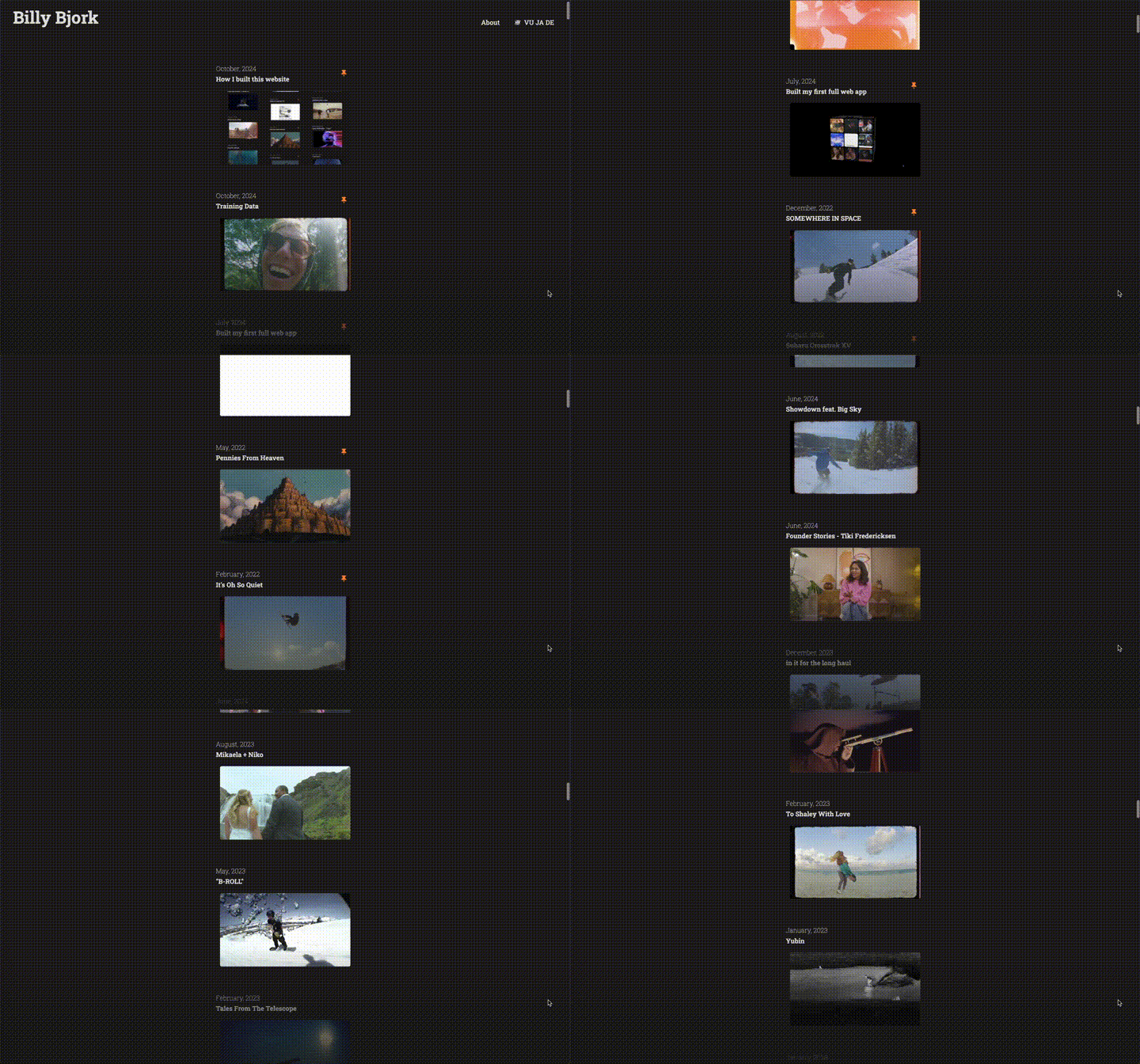
… a website, inside a website 🙄
For most of my life, my main creative outlet has been making videos. But for the last 9 months, most of my creative energy has gone towards learning to write software.
I’ve recently completed my second web development project—this website you’re currently visiting. I made it from scratch, and the rest of this post is about what I learned doing it.
We’ll look at some code snippets in Bash, Python, JavaScript, CSS, and HTML (extended with htmx and Jinja2). I’ll do my best to translate them for you (and myself).
Key features you might notice:
1. Dynamic Thumbnails
My previous site in Wix was a list of projects, each with a title, a date, and a thumbnail. That didn’t change.
Naturally, I wanted to build something that could not be done in Wix—some element of interactivity. Ideally, one that would work on both desktop and mobile, with little hassle.
I ruled out interactivity based on cursor/hover position, because realistically, you’re probably reading this from your phone, where the the cursor/hover state mostly doesn’t apply. Which led me to consider scrolling as the basis for interactivity.
The lightbulb moment: Why not have the thumbnails react to the visitor’s scrolling?
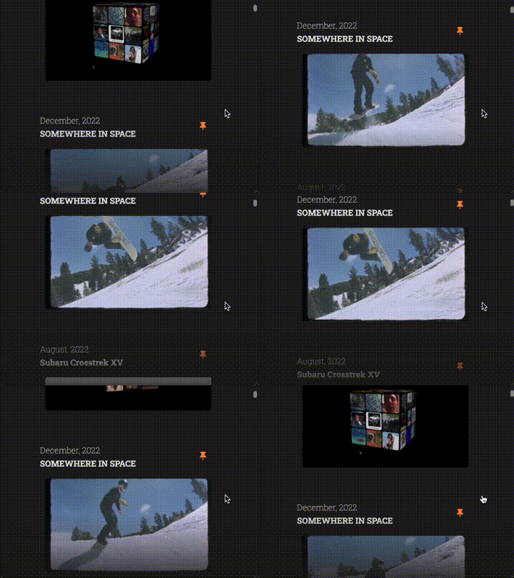
Both ChatGPT and Claude kindly assured me it could be done, and one good way to do it would utilize sprite sheets. Sprite sheets? New to me too.
A sprite sheet, I learned, is a single image file containing a grid of many smaller images. Sprite sheets give you precise control over frame-by-frame playback, such as quickly changing direction or speed, without the need for computationally-expensive video decoding. With a sprite sheet, your ‘video decoder’ can simply be JavaScript and CSS animations (which, can be GPU-accelerated on most modern devices).
The sprite sheet, or more broadly called a ‘texture atlas’, was invented to solve performance challenges by combining multiple smaller images into a single file that’s more efficient for graphics hardware to process.
These benefits have made sprite sheets a popular approach for character animations in 2D game development:
![]()
(source)
Turns out, you can also use sprite sheets to display frames of a video clip:
![]()
So how do you make one of those?
Easy task for ffmpeg, the Swiss Army Knife of media transcoding. ChatGPT helped craft the appropriate ffmpeg command based on my specifications for the input video duration, frame rate, output frame resolution, and grid dimensions. After some trial and error, here’s the command I used:
for f in *.mp4; do
  ffmpeg -i "$f" \
    -t 3 \
    -vf "fps=20,scale=320:180:force_original_aspect_ratio=increase,crop=320:180,tile=5x12" \
    -q:v 5 \
    "${f%.*}_sprite_sheet.jpg"
done
Translated:
- For each MP4 file in the current directory:
- Trim to the first 3 seconds
- Convert to 20 fps, and resize each frame to 320x180 px while maintaining dimensions
- Arrange the resulting 60 frames (20 fps × 3 sec) in a 5×12 grid
- Save as a medium-quality JPG with “_sprite_sheet.jpg” appended to the original file name
With that magical command, I turned my folder of trimmed videos into 50+ sprite sheets, in the blink of an eye.
![]()
Now, how do we put these sprite sheets to use?
First, I set up an HTML thumbnail element with specs matching those from the ffmpeg command. Then some JavaScript to wrangle in the CSS property for background-position, and let it dance with the scroll position.
I also wanted some kind of ‘easing’ to prevent the animation from feeling too rigid, similar to the idea of time remapping in video editing. Achieving that, I’ll admit, required some heavy-duty prompting and copy-pasting code, trying to coax the right JavaScript out of ChatGPT and Claude.
Here’s a condensed version of the code:
let animationProgress = 0;
let animationSpeed = 0;
let lastScrollTop = window.pageYOffset;
let lastScrollTime = Date.now();

// Update sprite sheet position for each thumbnail
const updateThumbnails = () => {
  document.querySelectorAll('.thumbnail').forEach(thumbnail => {
    // Get sprite sheet config from data attributes
    const { frames, frameWidth, frameHeight, columns } = thumbnail.dataset;

    // Calculate current frame position in sprite sheet
    let frameIndex = Math.floor(animationProgress) % frames;
    const frameX = (frameIndex % columns) * frameWidth;
    const frameY = Math.floor(frameIndex / columns) * frameHeight;

    // Apply position
    thumbnail.style.backgroundPosition = `-${frameX}px -${frameY}px`;
  });
};

// Convert scroll speed to animation speed
const handleScroll = () => {
  const currentScroll = window.pageYOffset;
  const deltaTime = (Date.now() - lastScrollTime) / 1000;

  // Calculate scroll velocity and convert to animation speed
  animationSpeed = (currentScroll - lastScrollTop) / (deltaTime * 3); // 3 = pixels per frame
  animationSpeed = Math.max(-30, Math.min(30, animationSpeed)); // Cap speed

  lastScrollTop = currentScroll;
  lastScrollTime = Date.now();
};

// Updates frame based on speed
const animationLoop = () => {
  // Apply deceleration
  const deceleration = 15 + Math.abs(animationSpeed) * 0.1;
  animationSpeed *= 0.95; // Simple friction

  // Update current frame
  animationProgress += animationSpeed * 0.016; // 0.016 = ~60fps
  if (animationProgress < 0) animationProgress += 60;

  updateThumbnails();
  requestAnimationFrame(animationLoop);
};

// Start animation
requestAnimationFrame(animationLoop);
Translated:
- Track animation progress and scroll speed.
- For each thumbnail:
- Get the sprite sheet specs from HTML data attributes
- Show the correct frame by adjusting the
background-position(to ‘move’ the visible area of the thumbnail) - Convert scroll speed to animation speed (capped at ±30).
- Run a continuous loop to:
- Update all thumbnails’ positions at 60fps
- Apply friction for a gradual deceleration after scrolling stops
Here’s what this looks like in action (I’ve included the background-position, which updates as you scroll):
2. Partial Rendering
Another central design goal was to make opening and closing projects seamless. Visitors should be able to peek into a project, then carry on scrolling without feeling like the page ever reloaded.
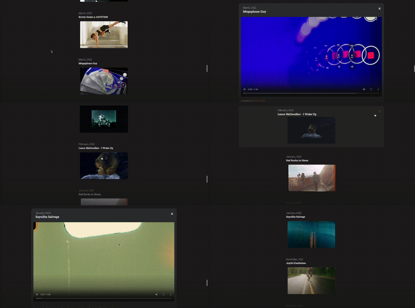
Designing for indecisiveness :)
While I could accomplish this using a framework like React, I wanted to escape the feeling of unmanageable JavaScript spaghetti code (self-imposed) I felt in when making my first web app, made using React. Plus, I still had so much to learn with plain-old HTML construction and templating. Seemingly, the only drawback, was the limited range of experiences that HTML could deliver.
That’s how I arrived at htmx, a library to help build dynamic web interactions using straightforward HTML syntax.

Htmx also comes with great memes
Htmx grants HTML an arsenal of superpowers, including:
- The ability to issue HTTP requests from any element, not just
<a>and<form>elements - Many different ways to trigger HTTP requests, such as on hover or visibility events, or on a timed interval
- Precise control over where the HTML returned by requests is placed
These capabilities made htmx perfect for handling project open/close transitions without full-page refreshes. Here’s how I used htmx attributes in my project-header element:
<header class="project-header"
        hx-get="/{{ project.slug }}"
        hx-target="#details-{{ project.slug }}"
        hx-swap="innerHTML"
        hx-trigger="click"
        hx-push-url="true">
  <!-- project title, date, thumbnail -->
</header>
Translated:
- When a project header is clicked (
hx-trigger="click"): - Fetch content associated with the project that was clicked (
hx-get="/{{ project.slug }}") - Replace the inner HTML of that project’s
#details-element with the content returned by the request - Update the URL in the browser’s address bar to reflect the project’s page (
hx-push-url="true")
With that, project headers now serve as buttons to open projects in place, right into the current page.

But that’s only part of the story. Let’s explore how those GET requests to /{{ project.slug }} are handled on the backend.
What’s notable about this the /{{ project.slug }} API endpoint is that it supports two similar but distinct use cases:
- If a project is clicked out of the list (request made by htmx), return partial page content
- If a user navigates directly to a project-specific URL (such as https://www.billybjork.com/pennies-from-heaven), return the complete page layout with all the dependencies, in addition to the specific project
While these distinct needs could have been supported by separate endpoints, servicing them with the same /{{ project.slug }} endpoint felt clearest, as both involve requests for specific project content.
Note how this endpoint distinguishes between htmx and non-htmx requests (I used FastAPI as my backend framework):
# Check if the request is an HTMX request
is_htmx = request.headers.get("HX-Request") == "true"

if is_htmx:
    if is_open:
        # Return the project details
        return templates.TemplateResponse("project_details.html", {
            "request": request,
            "project": project,
            "is_open": is_open,
            "meta_description": meta_description
        })
    else:
        # Return empty content for closing to prevent thumbnail duplication
        return Response(content='', status_code=200)

# For direct navigation, render the page with only the project
# Set a flag to indicate that we're in isolation mode
projects = [project]
isolation_mode = True

return templates.TemplateResponse("index.html", {
    "request": request,
    "projects": projects,
    "open_project": project if is_open else None,
    "current_year": datetime.now().year,
    "general_info": general_info,
    "isolation_mode": isolation_mode,
    "page_title": page_title,
    "page_meta_description": page_meta_description
})
Translation:
- If the request comes from htmx, and the project is in “open” state:
- Return the
project_details.htmltemplate - For direct navigation to a project URL (non-htmx requests):
- Return the
index.htmltemplate to create a project list containing only the requested project - Set
isolation_modetoTrueto indicate we’re showing a single project
With a little help from the backend, our project open/close transitions can be easily implemented by sprinkling some htmx attributes on project-header and a few other HTML elements.
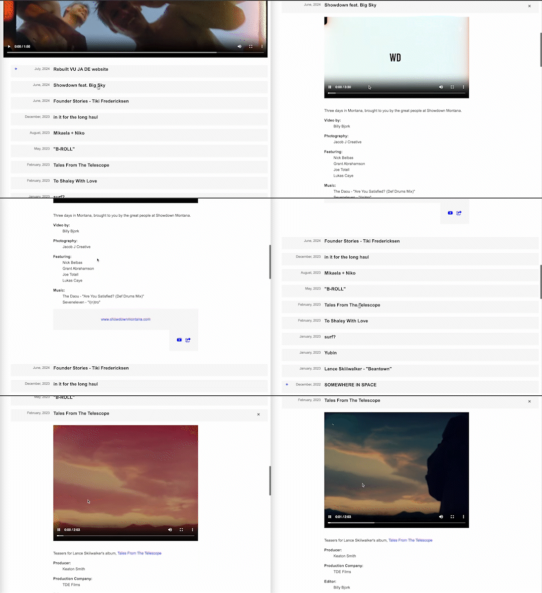
Here’s an early version, showing the ‘hello world’ moment for partial rendering with htmx:
2.5. Infinite Scroll
Before we move on, I’ll share one more functionality that htmx helped me achieve: infinite scroll.
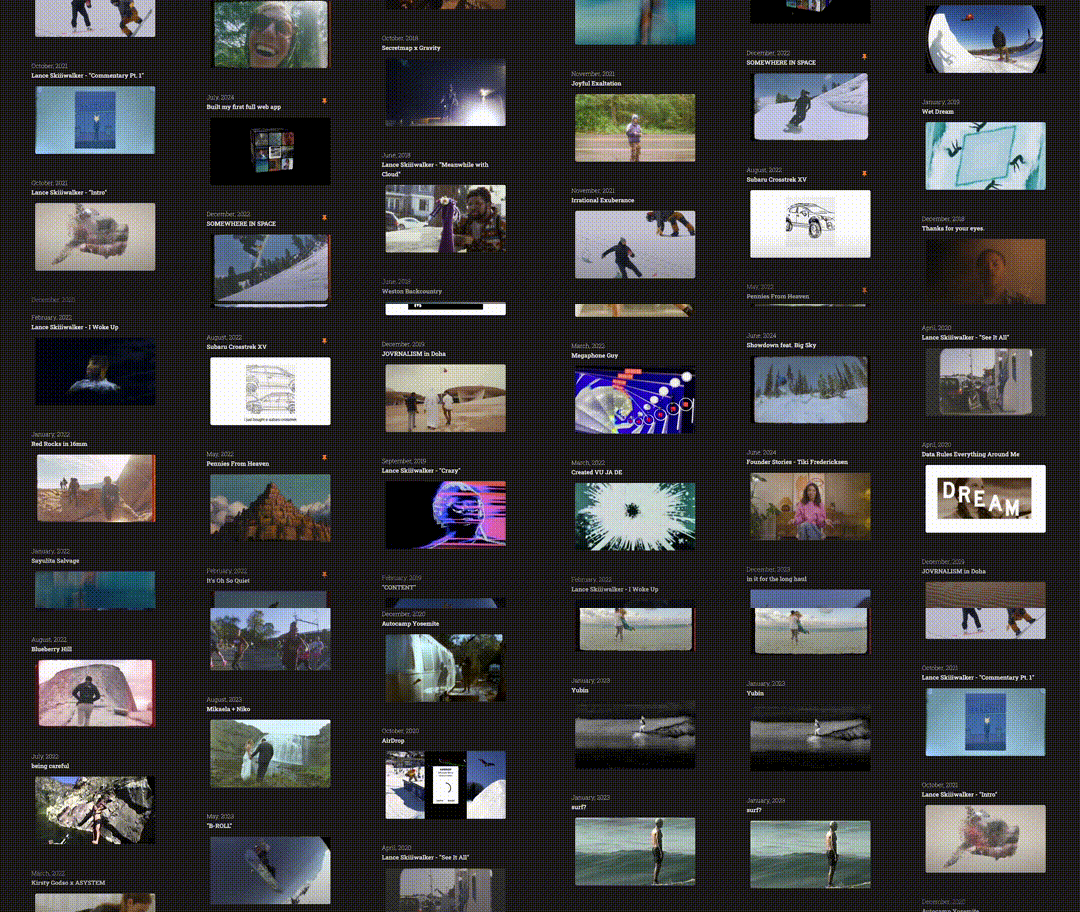
With over 50 projects and growing, it would not be practical to load the entire project list - thumbnails and all - right when you first load the site. So I needed pagination, but clunky “Next Page” buttons just don’t feel right when you’re scrolling through videos.
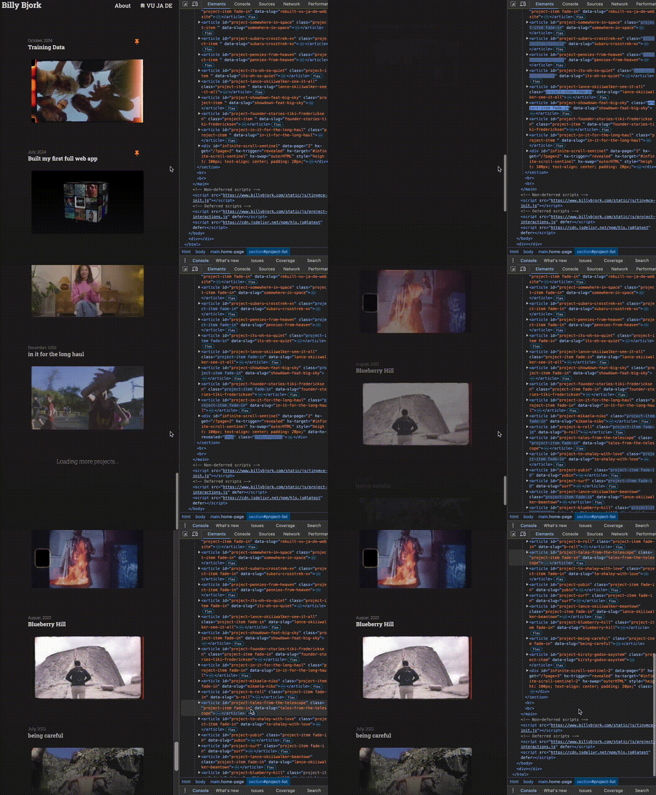
Instead, I chose to go with the infinite scroll pattern, in which more projects are loaded whenever the user gets to the bottom of the page, to enable continuous scrolling without full-page reloads.
This was another task well-suited for htmx, along with its partner-in-crime, Jinja2—the templating engine I used to stitch together my HTML components. Implementing an infinite scroll started with my project-list component, which was composed entirely of Jinja2 syntax:
<section id="project-list">
  {% set open_project = open_project if open_project is defined else None %}
  {% for project in projects %}
    {% set is_open = (open_project and open_project.slug == project.slug) %}
    {% include "project.html" with context %}
  {% endfor %}
  {% if not isolation_mode and has_more %}
    {% include "infinite_scroll_sentinel.html" %}
  {% endif %}
</section>
Translated:
- This is a section with the ID
project-list - Check if there’s an
open_project - Loop through all projects in the
projectslist. For each project: - Check if it’s currently “open” by comparing its slug with the
open_project’s slug - Include
project.htmlto render each individual project - After all projects are rendered, check if NOT in
isolation_mode(i.e. direct navigation to a project URL) and there are more projects to load. - If both conditions are true, include
infinite_scroll_sentinel.html, which we’ll explore below.
Here is infinite_scroll_sentinel.html, which is injected into the project list to carry out the infinite scroll:
<div id="infinite-scroll-sentinel-{{ current_page }}"
     {% if has_more %}
     hx-get="/projects?page={{ next_page }}"
     hx-trigger="revealed"
     hx-swap="outerHTML"
     style="height: 100px; text-align: center; padding: 20px;">
  Loading more projects...
</div>
{% else %}
<div style="height: 100px; text-align: center; padding: 20px; display: none;">
</div>
{% endif %}
Translated:
- Create a sentinel (observer) element with a unique ID based on the current page number
- If there are more projects to load (
has_moreis true): - Store the next page number
- When this element becomes visible on screen (
hx-trigger="revealed"), fetch the next page of projects, which will replace this entire sentinel element - While loading, show “Loading more projects…”
- If there are no more projects (
has_moreis false), create a hidden placeholder
With that, additional projects are loaded whenever the viewport reaches the bottom of page:
3. Video Player
As a website consisting mostly of video projects, I knew it needed an exceptional video player. While I previously relied on embeds from YouTube or Vimeo, I always felt the playback experience was slower and clunkier than it needed to be.

Video player in my previous Wix site

When you’re so fixated on the new video player that you forget to watch the video
Today’s browsers come with highly capable native video players, and using them can be as easy as throwing a link into a <video> element. Initially, I gave it the MP4 files I had readily available, served through the AWS CloudFront CDN.
But to match and exceed the experience of YouTube/Vimeo, simply streaming MP4 files wasn’t enough. To ensure smooth playback even with variable or poor connectivity, I had to embrace adaptive bitrate streaming.
In other words, rather than serving one fixed-quality video file, I needed to serve the content in varying quality levels that automatically adjust based on the viewer’s connection speed.
How? With HTTP Live Streaming (HLS), a protocol that serves different video qualities based on network conditions.
For a second time, implementing this feature starts with ffmpeg—which allows us to efficiently transcode the the five versions of each video file, broken into chunks. This snippet gives a taste of how it works:
ffmpeg_cmd+=" -filter_complex \"[0:v]split=5[v1][v2][v3][v4][v5]; \
  [v1]scale=$(calculate_scale 1080)[v1out]; [v2]scale=$(calculate_scale 720)[v2out]; \
  [v3]scale=$(calculate_scale 480)[v3out]; [v4]scale=$(calculate_scale 360)[v4out]; \
  [v5]scale=$(calculate_scale 240)[v5out]\""

ffmpeg_cmd+=" -map \"[v1out]\" -c:v:0 libx264 -b:v:0 5000k -maxrate:v:0 5350k -bufsize:v:0 7500k"
ffmpeg_cmd+=" -map \"[v2out]\" -c:v:1 libx264 -b:v:1 2800k -maxrate:v:1 2996k -bufsize:v:1 4200k"
ffmpeg_cmd+=" -map \"[v3out]\" -c:v:2 libx264 -b:v:2 1400k -maxrate:v:2 1498k -bufsize:v:2 2100k"
ffmpeg_cmd+=" -map \"[v4out]\" -c:v:3 libx264 -b:v:3 800k -maxrate:v:3 856k -bufsize:v:3 1200k"
ffmpeg_cmd+=" -map \"[v5out]\" -c:v:4 libx264 -b:v:4 500k -maxrate:v:4 535k -bufsize:v:4 750k"

ffmpeg_cmd+=" -map a:0 -map a:0 -map a:0 -map a:0 -map a:0"
variant_map="v:0,a:0 v:1,a:1 v:2,a:2 v:3,a:3 v:4,a:4"
Translated:
- Create 5 video qualities: 1080p (5000kbps), 720p (2800kbps), 480p (1400kbps), 360p (800kbps), 240p (500kbps)
- Split the original video, and scale each version to its resolution
- Encode each in the H.264 codec and optimized bitrates
- Copy audio to all versions
- Map everything together for adaptive streaming
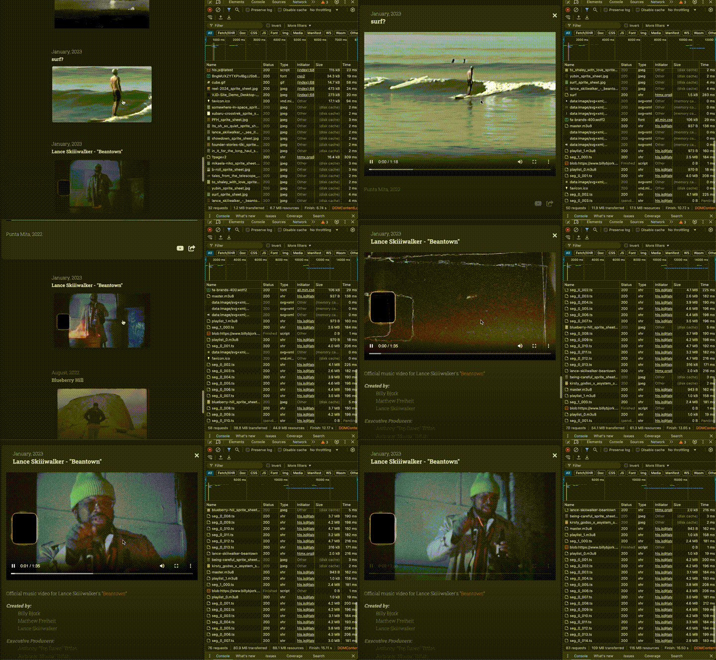
This process produces a set of .ts files (video fragments in various sizes) along with various .m3u8 files (‘playlist’ files to orchestrate the stream). I stored these files in my S3 bucket, in a subfolder for each project.
The master.m3u8 file link is what you ultimately pass into <video> elements, which tells the browser which version of the video to load depending on the network conditions.
Here’s what video streaming using HLS looks like, in network requests:
Bonus Preview: CMS
As a replacement of my previous website on Wix, this project involved not only the user interface for browsing projects, it’s also become my personal content management system (CMS).
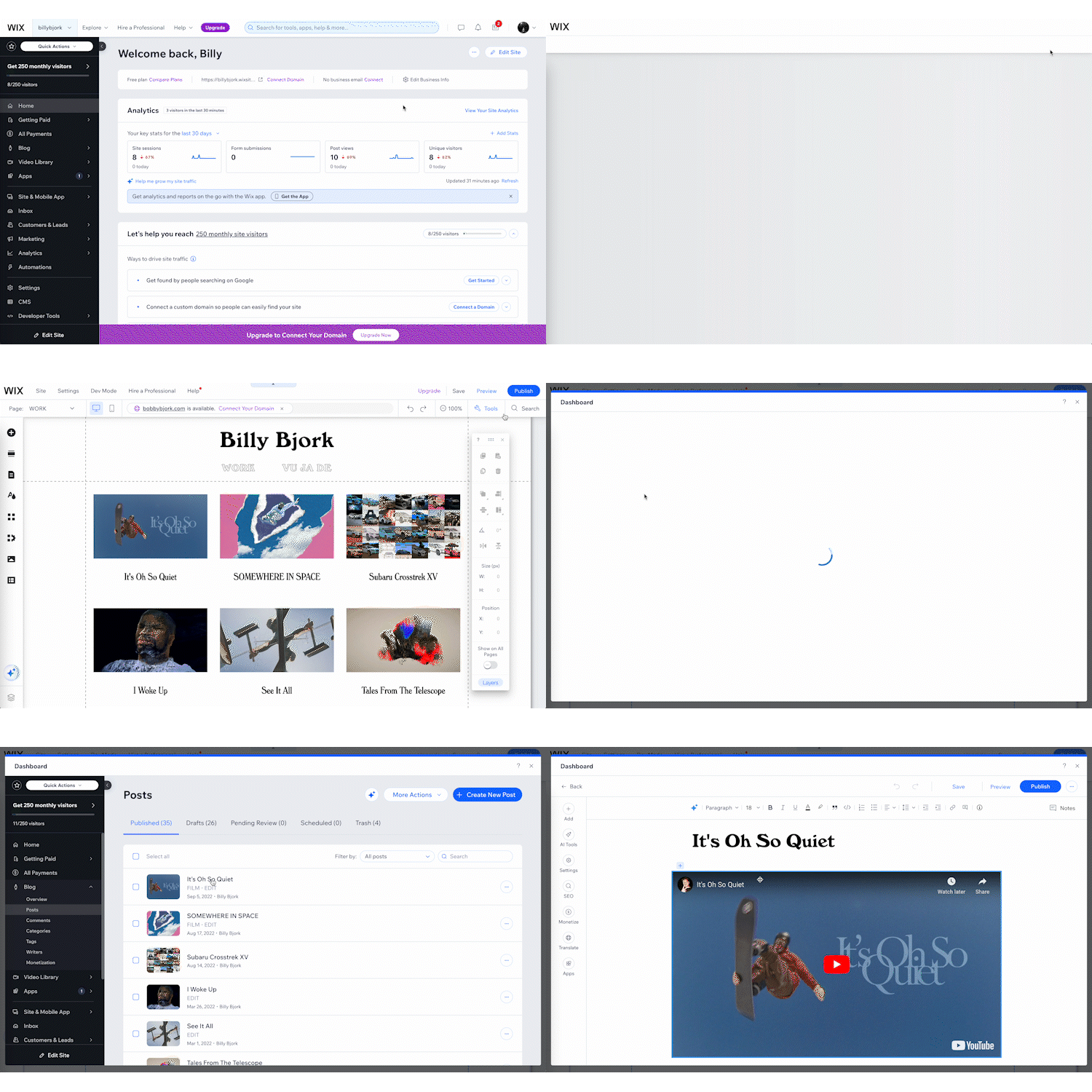
CMS interface from my previous Wix site (sped up to 300% speed)
This website’s content is stored in a Postgres database (using Supabase), with media assets hosted in AWS S3. While these are serving me well, neither is practical as a CMS. Instead, I want to be able to create, update, and delete projects (including uploads for media files) all within this website.
So, how hard could it be to just use this website as my CMS?
Not that hard, as it turns out. I’ve implemented some of this already, which is why I’m currently writing this post at billybjork.com/how-i-built-this/edit, without touching the raw HTML.
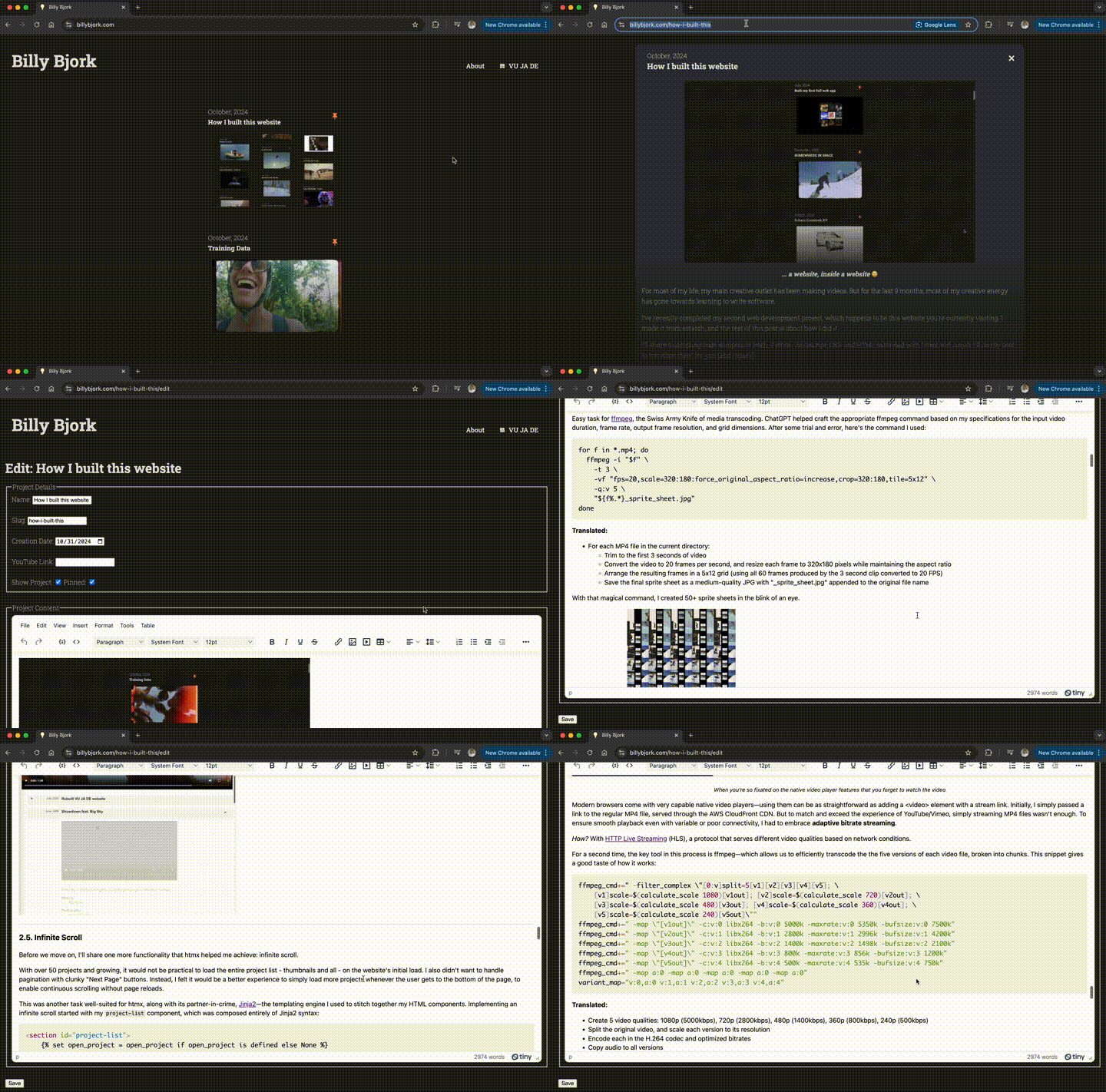
Current CMS interface (real time)
Here’s what I’ve accomplished so far on the CMS front:
- Simple interfaces to edit my About page, to edit individual projects, and to create new projects
- Authenticated API endpoints to render those pages at
/editendpoints, and the accept responses to form submissions in those pages - A rich text editor (using TinyMCE) and code highlighting (using PrismJS)
My to-do list includes:
- Pipeline for file uploads and transcodes, to eliminate the need to manually convert files to web-friendly file sizes (including those HLS transcodes) and upload via the S3 console
- Simple admin panel to view all hidden/unpublished drafts of projects/posts.
- Auto-save functionality in my project text editor.
- Personal display for project stats, like view count and number of unique visitors
Once this is all built out, I’ll cover how it works a future post.
Building this site took longer than expected (obviously), but it offered plenty of learning moments. I reconnected with an old friend in ffmpeg, and got to meet some new friends: htmx and Jinja2.
Most time-consuming (predictably) was the interaction design—where HTML and CSS interfaced directly with JavaScript. This also produced the most challenges in maintaining consistency across browsers and devices.
While I, admittedly, copy/pasted a lot of code from ChatGPT and Claude, I have a much stronger understanding of web development fundamentals than I did when I set forth on my first web app. Most notably, I now have a much stronger grasp of:
- Semantic HTML and templating
- CSS selectors and variables
- Using browser developer tools to debug errors, inspect HTML elements and CSS styles, and understand network requests
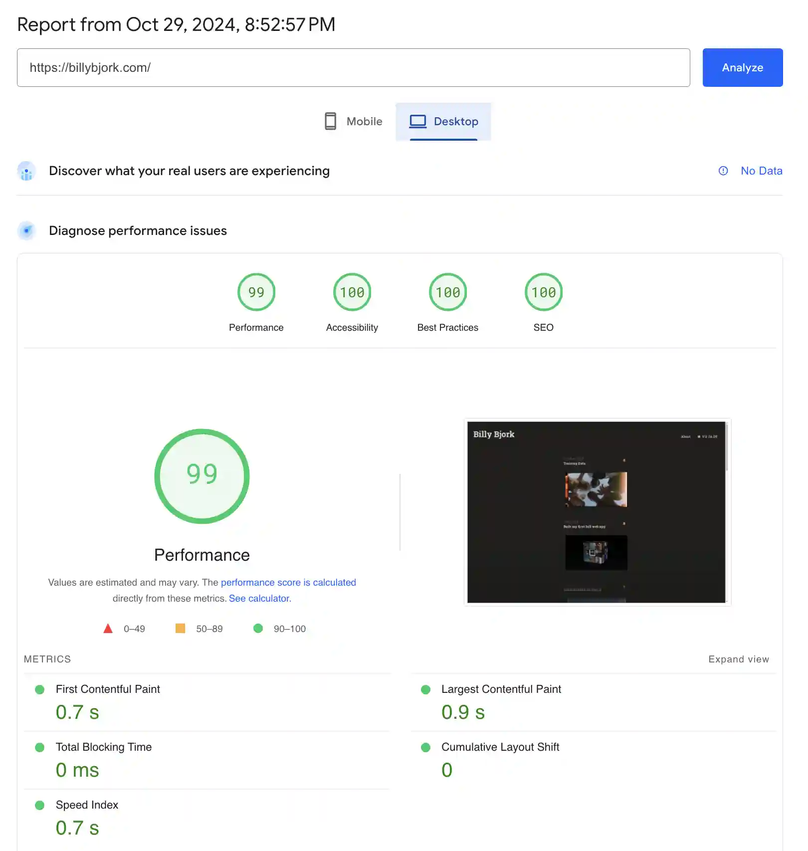
A nice hit of validation: the site now loads over 3x faster than my previous site on Wix (1470 ms → 450 ms). I’ll credit this improvement mostly to cutting the enormous bloat of a website builder that serves millions of people (the old site made 152 network requests on the initial load; my current site makes 16).
More validation: the PageSpeed Insights scores…
If you’re not long gone by now… you may enjoy peeking into full source code.
Thank you very much for reading this far.
More to come :)